PulseBreaker
Playtest review
Genre familiarity: Very high. I have played a lot of classic survival horror, including Resident Evil, Silent Hill, Dino Crisis and Parasite Eve.
Playtest video
Overall Experience
Let me start by saying, Pulsebreaker feels like an incredibly well made game, made by someone/a team that know what they are doing. I can say without question that I thoroughly enjoyed every minute of PulseBreaker. I completed the demo in a single sitting and would have happily continued playing had there been more available. I don't enjoy every game I playtest, but I enjoyed this from beginning to end. I was constantly motivated to continue, I was enjoying the gameplay, and for the full duration of the demo, I wanted to see what came next. I never experienced any real frustration, and while there are some very minor areas of potential improvement, this is a beautiful homage to classic survival horror.
The biggest strength for me is how cohesive the whole game feels. The influence of old school fixed camera survival horror is obviously very strong, but your take on modernising the combat, and adding some quality of life features make this both playable, and enjoyable. The camera composition, combat, inventory management, resource conservation, audio, environmental writing and general pacing all contribute to it. At the same time, there are some sensible modern additions that stop it from feeling like it is a direct clone of its predecessors.
I suspect most people will not go into a PS1 styled survival horror expecting true horror, so do take this next comment with a pinch of salt, but for me, there was very little actual horror and tension. I had a lot of fun throughout, but I never felt fear and rarely felt particularly vulnerable. I selected the normal difficulty, and IMO it felt slightly too easy. I didn't die once, despite not playing particularly safely and taking what must have been at least fifteen plus bites. I actually had to reload after completing the demo because I wanted to see what the Game Over screen looked like.
There were also a couple of potentially excellent moments of tension that were instead presented to me through cutscenes, which while cinematically good, reduced the potential tension. The cutscenes themselves are very well made, but I think taking control away from me for these moments actually reduced their ability to unsettle me. This became one of the more consistent thoughts I had throughout the playthrough.
That said, the pros very much outweigh the cons, as you will see in the body of this review. Without question., Pulsebreaker is already a fantastically well made game.
Presentation
It goes without saying that, the PS1 survival horror influence is immediately obvious. The pixelated, low resolution presentation works very well, and I think you've captured the feel of the texture resolution and filtering particularly well. The dithering is also a nice touch. At the same time, this feels more like a modern interpretation of the PS1 aesthetic than an attempt to accurately replicate PS1 rendering exactly, or at least I’m assuming this was your intention. I didn't notice the texture warping or polygon jitter associated with actual PS1 rendering. In particular, I didn't notice affine texture warping, or if it is present it certainly wasn't noticeable to me. I want to be clear that this isn’t a criticism. I don't think the game necessarily needs those effects, and the visual style is beautiful as it is. I’m assuming you've chosen to recreate the visual style of that period without necessarily reproducing every technical limitation that created it, which still gives an awesome aesthetic. I really enjoyed that mix of retro with a touch of modernisation.
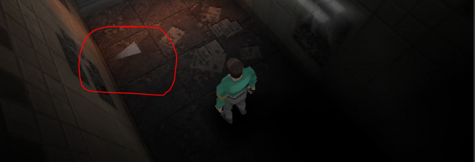
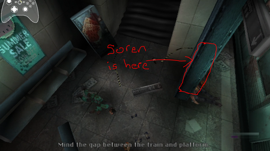
There are a few places you through in some modern game design elements rather than staying 100% faithful to the source. Something as simple as making foreground geometry transparent (shown in Fig-2 below) when it would otherwise obscure Soren is perfect. It solves one of the practical problems of fixed camera presentation without interfering with the style.
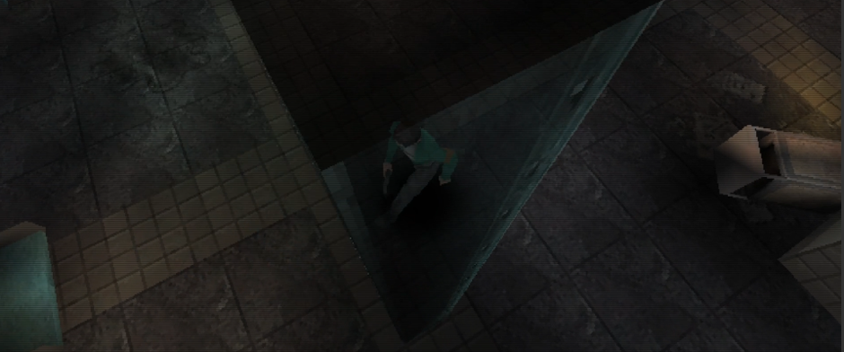
Your scene framing throughout is really good. I found it super engaging. There are also some really beautiful compositions (Fig-3 below) throughout the demo. Some of my favourite shots were in the more confined spaces, like the one seen in the screenshot below, or the camera angle looking out from within the supply closet room. I find that these shots make excellent use of the limited visibility to drive home that claustrophobic feeling. The slight camera sway adds a lot to this too.
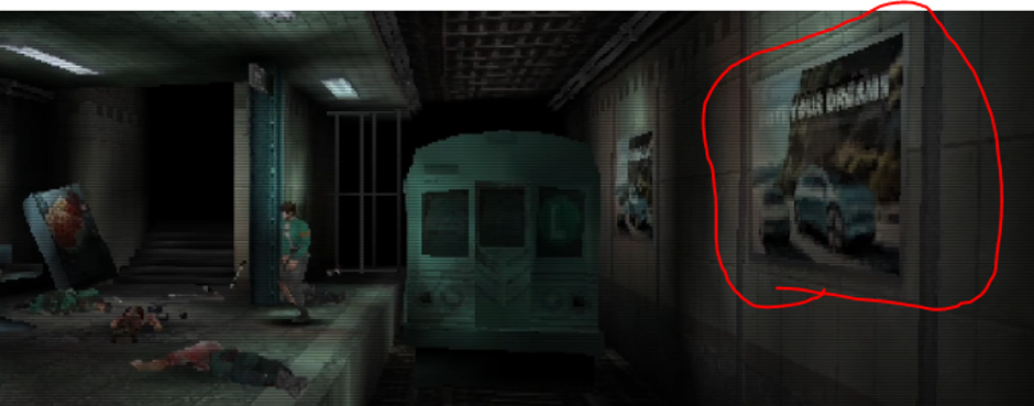
This is really not a bug, and should probably not be in this section, but just in case its gone unnoticed, one thing that stood out was an advertisement that felt quite modern compared with everything around it. I appreciate the game is set in 1997 rather than the distant past, but both the car itself and the format of the advertisement looked quite modern, like it wouldn't be out of place in 2026.
Cinematics
As a sucker for old school Resident Evil, your presentation style had me immediately interested. Even selecting START DEMO and hearing the spoken "PulseBreaker" title pays beautiful homage to RE, and sets the tone before the game has really begun.
I thought you did a good job at setting the expectation through the very first cutscene. The brief switch into first person as Soren enters the metro feels like an RE homage again, which I enjoyed. The loud echo of his footsteps contrasts really well with the general silence of the rest of that starting area.
I also quite liked the framing of the interaction between Soren and Freya. I thought the cinematic shots were excellent, and as a tiny side note on this scene, having the dialogue UI physically shake when characters shout or panic is a lovely detail. There is a slightly awkward quality to some of the cinematography and character presentation that reminded me of old Silent Hill cutscenes, but in a way that feels nostalgic, and I for one, welcome it.
Another extremely minor point, but the opening composition for this Freya cutscene makes the big red PHONE sign look very prominent, which initially made me think it was being deliberately brought to my attention. The following shot then comes from almost the complete opposite direction. Again, nothing inherently wrong with this, but I actually thought the phone was going to become prominent based on that one opening shot.
Camera
Overall, I think the composition of the fixed cameras is largely spot on. There are a lot of shots where even deliberately limited visibility feels justified by the composition.You used quite a range of different camera angles, which was great in terms of variety. For example, there’s a mixture of long corridor shots, slightly overhead shots., foreground dominant shots, low down shots (sucg as when you first enter the subway platform).
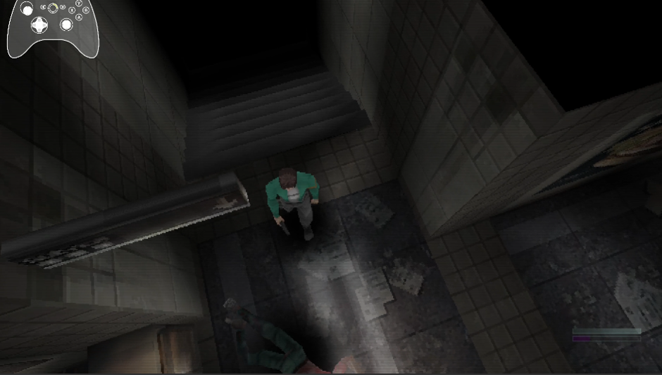
There were a small number of exceptions where one or two shots didn't feel like they had a camera configured well for the scene. I didn’t personally like the ones that were very dominantly top down (shown in Fig-5). I can accept the choice to give me little visibility but it's nice when it feels intentional. In the screenshot below, there is hardly any visibility, and its also just an awkward camera angle and not a well composited shot. This only stood out because the vast majority of the camera angles you chose felt intentional.
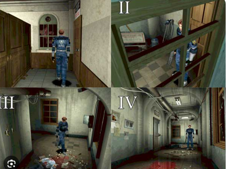
By comparison, this is a set of screenshots from RE2 (Fig-6) where visibility is still heavily restricted, but the composition itself is very strong, drawing my eye to various places.
.
(Fig 6 - Example of well constructed camera angles)
My biggest issue with Pulsebreaker was movement during transitions between fixed cameras. A good few times I felt as though my direction changed as I transitioned into another shot. This is one of the main reasons I personally prefer tank controls in fixed camera games, and would have loved tank controls as an option (though I fully accept I am in the minority here). I actually started the demo by looking through the settings for a tank control option.
Once I became accustomed to the current controls, however, they made sense very quickly. There were just a good few times where I would move, the camera would change, and without tank controls, I was more likely to have an awkward change of direction.
Tutorial
I thought the tutorial was very convenient, really well introduced, and being able to watch a video demonstration is a great touch, which I used twice. Initially, I was a bit unsure if I found the controls intuitive, but having spent some time with the game, I quite like them. However, whilst on the topic of the tutorial, I think switching targets should be covered explicitly in the tutorial, as currently, it is not.
Immediately after the Freya cutscene, the game presents the player with two zombies rather than introducing the player to a single enemy, and despite doing the tutorial, this is where I realized I didn't know how to change which enemy I was targeting when multiple enemies were approaching. I eventually figured out that Right Bumper switches targets, but I discovered that myself rather than learning it from the tutorial, and embarrassingly enough, I only figured this out when playing around after completing the demo, so I played the whole demo unaware I could swap targets. Given that the game presents multiple enemies almost immediately, it might be worth explicitly introducing this in the tutorial.
Even though its not something I ended up doing an awful lot in the demo, one of the things I loved about the combat, that you explicitly teach in the tutorial, is targeting the legs to bring a zombie to their knees. This is pretty awesome, and the thrust kick is pretty satisfying. However, when I aim down towards a zombie's legs, the targeting reticle doesn't actually move down the zombie's body, which as a player I would expect, as an indicator of where I’m targeting.
Gameplay (combat)
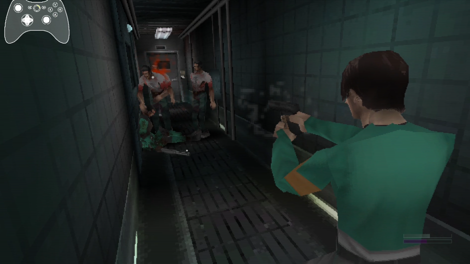
The combat feels quite polished in many respects. I think you've found a really nice balance between old school survival horror combat and putting an additional layer on top of it through targeted body parts, the focus meter, critical shots, kicks, damage modifiers if poisoned, and anything else I may have missed or not been privy too from the demo alone. The shotgun is by far the most satisfying weapon to use. It feels significantly more impactful than the pistol, and landing a critical shot with it feels like it packs a proper punch. There is a very clear difference between the two weapons. I used the knife for a bit too, though, as with the original RE, I am so bad with it, that I may as well leave it in storage.
The focus meter, for me, is bordering on a fantastic idea, with an implementation that felt like it was missing a UI pass. Its quite subtle, which again, is likely intentional, but it felt a bit disjointed in its current form. The actual meter itself is in the bottom right of the screen, while the READY prompt when its full, is in the top left, yet I'm never looking at either as I'm shooting zombies. I would have loved a slightly more spatially aware UI positioned closer to where my natural gaze is, if not perhaps even more diagetic. The concept of building a focus meter is ultiamtely a good feature, and one I would be keen to see more of, particularly as I unlock different weapons. Building it through combat before being able to perform a critical attack or kick is very well suited. One question only occurred to me after finishing: how am I intended to safely build focus when using only the knife? I didn't properly investigate this during the playthrough as I didnt use the knife much, so I can't comment on whether there is actually a problem there, but it was something I found myself wondering afterwards.
I didn't actually use the kick until relatively late in the demo. It simply wasn't something that remained hugely prevalent in my mind during combat, particularly when dealing with more than one zombie.
As mentioned above, I didnt use the knife much at all. I found the shooting to be incredibly satisfying, and very intuitive overall. The pistol feels nicely in that range between weak and medium, where you want to focus to get that critical shot, where the shotgun felt noticeably more powerful. I was really happy with how the weapons felt.
I found that I could pass through zombies if I timed my movement correctly. I did this multiple times during the tutorial, but didnt really try to do it during the main level. I don't know whether this is intentional, perhaps to stop the player becoming completely trapped in a corner, or a collision issue.
Difficulty
I played on Medium, which was the highest difficulty available in the demo. Having completed it, I think it felt slightly too easy. At one point early on I realised I had been playing almost completely opposite to how I would naturally approach Resident Evil, Dino Crisis or Parasite Eve. Normally I preserve ammunition aggressively and avoid enemies whenever possible. Here I had been quite trigger happy, and I remember suddenly thinking that I might have made the rest of the demo significantly harder for myself. From that point onwards I deliberately became more conservative. Later in the demo I was herding groups of zombies around rather than automatically spending ammunition on them. I think the actual ammunition balance is good. Ammo felt relatively scarce and I did occasionally find myself low or completely out, but I never felt that I couldn't progress or that ammunition had been distributed too conservatively.
When it comes to player health, how much damage the player can take, and how many first aid tablets are in the level (which I think is three), I think you’re being marginally too generous in the players' favour. I must have taken at least ten bites during the playthrough and never died. I didn't play particularly safely either. I only saw the Game Over screen because I deliberately loaded the game again after completing the demo to see what happened on death, and I’m not that good at the game.
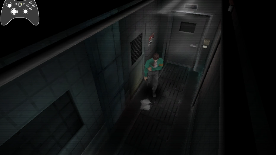
Regarding health, the injured walking animation is an excellent way of communicating Soren's condition without relying on a permanent health bar (shown in Fig-7 below). It was immediately obvious to me that he was injured simply from looking at him, and the animation itself is top quality.
The lack of an ammunition counter during normal gameplay is something I was slightly divided on. It would certainly be useful to see my remaining ammo, but I also appreciate that withholding that information from the normal HUD fits the old school survival horror approach, and it certainly added to the tension, and made encounters a bit more exciting.
Infection
You introduce this to the player quite late into the demo. By the time the infection explanation below is introduced, the player has already faced countless zombies, and likely been bitten many times over.
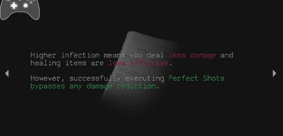
It’s a very minor point of feedback, but it wasn't clear to me why infection would cause Soren to deal less damage. I don’t think I would intuitively expect my bullets to do less damage because Soren is infected. But that aside, more importantly, infection just wasn’t ever something I consciously thought about, even after it was introduced. My infection eventually reached 57%, and it still didn't influence a single decision I made. I used the medkit in the safe room and then moved on. I didn't change how I approached combat, exploration or resource use because of my infection level, and I essentially forgot the system existed.
That may simply be because this is an early section and the consequences become more important later. However, based purely on my experience of the demo, something that I assume was presented as an important system just didn't affect my decision-making.
Inventory (inc. PC, Storage etc)
Inventory management was largely what I expected and wanted from this type of game, and all in all, you’ve nailed this style of inventory. I would say this is pretty much what most lovers of this genre would expect. Visually, it captures the RE essence beautifully, and it's very easily readable.
I felt like I should be able to combine my gun with its ammunition to reload it. I instinctively attempted this once or twice to clear up some inventory space, but it doesn't work.
The inability to drop an item without discarding it fits the game style. You have two rooms with storage via the PC, so I think you give the player enough points at which to manage their inventory (more on this later).
Combining gunpowder to create shotgun ammunition worked well, and is intuitive. It was immediately obvious to me what combining those items would produce.
The button mappings when using the STORAGE functionality on the PC tripped me up so many times. I repeatedly found myself wanting to use the D-pad to move focus between my inventory and the storage box, but the D-pad just changes to the next storage page. You’ll see me do that many times over in the video. Visually, the computer and storage presentation is beautiful and fits the classic survival horror influence perfectly.
Saving through the computer is extremely fast, which I appreciated. There is essentially no friction between deciding to save and returning to the game. You’ve nailed this.
There is no equivalent to Resident Evil's ink ribbons restricting how frequently I can save. Personally, I prefer unlimited saving. Players sometimes simply need to stop playing, and I don't think accommodating that is a bad thing. It does remove one potential source of tension, though, particularly when combined with the relatively forgiving health/difficulty on medium difficulty.
UI/Menus
The overall UI fits the visual direction extremely well, and there are some lovely small details.
Very minor point here again, but I found it quite jarring switching between the inventory, files, and map via the menu. The UI animation essentially resets during the transition, including the surrounding filler UI, and that is very jarring. I think it would feel considerably smoother if the surrounding interface remained stable and only the central content changed.
The 3D icons (seen in Fig-9) used to identify things like maps and other readable objects does its job very well. Its basically impossible to miss these. One could argue they could potentially be more subtle but I think they do exactly what you intend for them to do. There's nothing inherently wrong with them being very obvious, but elsewhere the game is quite comfortable allowing me to work things out for myself. As a result, it could be argued that these comparatively prominent markers felt slightly out of place, though I feel this is subjective.
The map system works as I’d expect it to work in survival horror games. The red, green, white colour scheme works perfectly. The maps are easily readable, and as I have said many times throughout this report, the homage to the survival horror games of old, is captured perfectly.
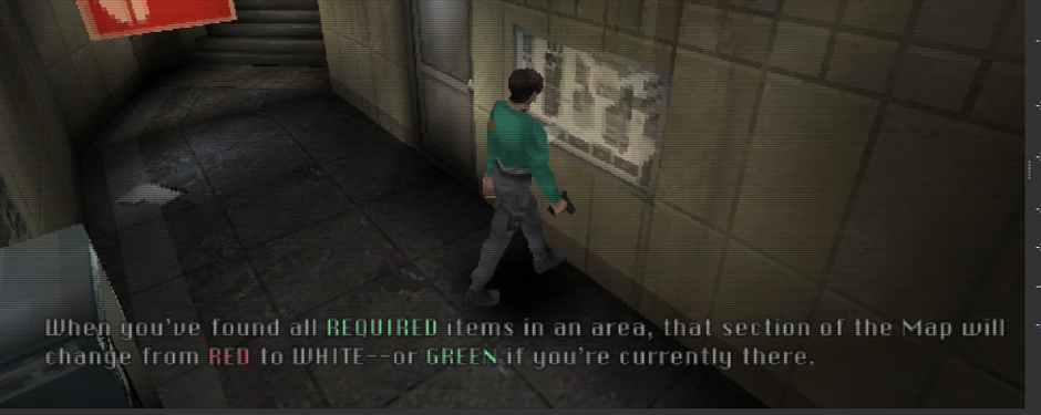
Despite being extremely familiar with Resident Evil and Silent Hill, it took me quite a while to even think about opening the map. I think that's largely because the demo is relatively linear and and the level layout does a really good job at effectively guiding the player through, to the point that for large periods I felt I didn’t need the map (though I then felt once you introduced it to me, I became far more reliant on it).
I’ve mentioned it elsewhere, but again, I love that you’ve gone completely minimalist with hardly any UI during gameplay.
Gameplay (non-combat)
I think the amount of exploration in this opening section is about right. The environment is fairly guided and generally doesn't let you move very far away from the main route. For an early section where I'm still learning how everything works, I don't think you’d made the level a perfect size that encourages a bit of exploration, but never allows you go off track.
The puzzles were extremely easy overall. Keys and doors are clearly labelled. The blacklight puzzle in particular was immediately obvious, and though the demo ended before I got to complete the puzzle, it was also clear what I needed to do with the drain and crowbar. I think that's reasonable for early-game puzzle difficulty. I wouldn't make the opening more complicated purely because an experienced survival horror player can solve these things quickly.
Backtracking also worked well. There is a reasonable amount of it, but it never becomes tedious. There were one or two occasions where I left a safe room knowing my inventory was still quite full and consequently had to return sooner than I otherwise would have, but that was the result of my own inventory decisions. The layout also made the backtracking feel natural rather than arbitrary, and having access to a safe room/computer at either end meant I never had to traverse the entire environment purely to access storage or save.
Horror/Tension
The atmosphere is very cohesive, and visually and aurally, Pulsebreaker draws from its inspirations absolutely beautifully. I never felt scared during the demo and didn't experience a great deal of sustained tension, despite thoroughly enjoying myself. Part of this is simply subjective. As beautiful as the visual style is, this particular retro aesthetic isn't one that I personally find highly capable of creating deep fear in a modern game. However, aesthetic design aside, I think there are some places where design decisions contribute to that lack of tension.
The corpses on the subway platform eventually reanimate, which is a good idea, but I'm shown this through a cutscene. Once I've seen that happen cinematically, it kills any chance of tension. I understand that you’ve shown it through a cutscene in order to direct me back that way as a player, which is perfect, though at the cost of tension build up.
Similarly, the sequence involving zombies breaking through the supply closet door is a really nice moment, but would have been so much more effective during gameplay. If I were walking through the corridor and a zombie unexpectedly smashed through a boarded door, every boarded door I passed afterwards would potentially make me nervous.
I would also say that the difficulty contributed as well. I never worked out just how many bites it takes to kill Soren, but beacause I could absorb so much damage and never died, I rarely felt like an encounter was too dangerous.
Despite not being scared by the game, there are some very good individual encounters. In the bathroom with no light, the positioning of the the corpse between the two standing zombies is very effective. I thought that was very well constructed.
All of the enemies I fought during the demo were ultimately the same broad type of standard zombie, despite the different character models. I don't think that's a problem for an opening section. I suspect the demo ending is about to introduce a new zombie type, but everything I actually fought during the playable portion behaved within the same general enemy archetype.
Audio and Music
The sound effects are excellent overall.
There are so many sfx that I want to mention, that all just gel together so well. The running audio, and the echo, that just amplifies that lingering emptiness. The zombies groans, the rustling of their clothes as they move, it all just works so well.
Its a very small touch, but I also really liked that the subway intercom audio continues while I'm in menus. It’s a small thing but it keeps me grounded in the scene rather than making the inventory feel like a completely separate space.
The only sound effect I remember actively disliking was the flickering light sfx (outside the ticket booth, and on the subway platform). To me, it sounded far more like someone navigating a game menu than a flickering electrical light, and it briefly stood out against otherwise excellent sound design.
The soft, mellow theme suits the game extremely well too. Its very sombre, and almost lonely.
Subtle details
There are a lot of small details that contribute to how polished the demo feels. I enjoy reading the descriptive text when you interact with static objects. A lot of it is beautifully written, and it makes examining otherwise mundane parts of the environment worthwhile. I mostly do this to try and find hidden items (such as in the trash can on the subway platform).
I liked Soren's idle animation when I left him standing around. It's completely unnecessary, but adds personality.
The UI (files) having key words colour coded is a great touch. It makes the text far more consumable.
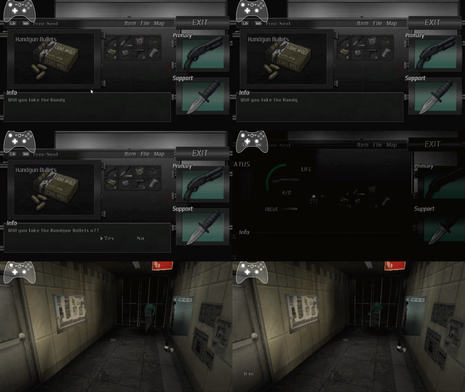
One of my favourite little details, which can be seen in Gif-1 below, is the subtle animation when ammunition is stacked. Its a tiny detail, but the kind of polish that adds up.
(Gif-1 - Beautiful item stacking UI transition)
None of these details are substantial by themselves, but collectively they contribute to Pulsebreaker feeling incredibly polished.
Characters (Soren, Freya)
I was about as interested in the story as I would expect to be at this point in a game of this type. As much as I enjoy survival horror, its not usually renowned for its oscar winning stories. I’d be lying if I said I kept playing for the story, but I thought the game did a good job matching the tone of the survival horror games inspiring it. Freya fills that mysterious-character role that is very familiar within the genre, and I was interested enough in what was happening to want to see where it went. I would say that the cinematic direction did more for me than the story itself at this stage. The dialogue presentation, framing and general tone fit the scenes very well though, and to me, none of it came across as being at a lower standard than the games that inspired Pulsebreaker.
Demo Ending
Very early in the game I saw the elevator without power. From that point onwards, I assumed restoring power to it was ultimately going to be the endpoint of the demo. Only you will know why the demo ends when it does. To me, it felt like an unnatural ending point, given that I was essentially mid way through a few puzzles. I had been introduced to the item stuck in the drain and had collected the magnet. There was a locked door near the safe room (in the same corridor that the demo ends), and there was the elevator without power. Again, not at all a criticism, I'm just giving my thoughts as a player. When the demo ended, I was left wanting to play more.
The use of controller vibration during this cutscene was excellent, and gave that shot of him running at Soren a lot more impact. The vibration created a strong physical sense that something is rapidly approaching.
The zombie that runs at the player as the demo ends looks visually the same as other zombies. I assume you're introducing a new type of faster zombie here which I think will be a great addition.
Presentation issues (but not bugs per say)
There are a couple of small text issues shown below.
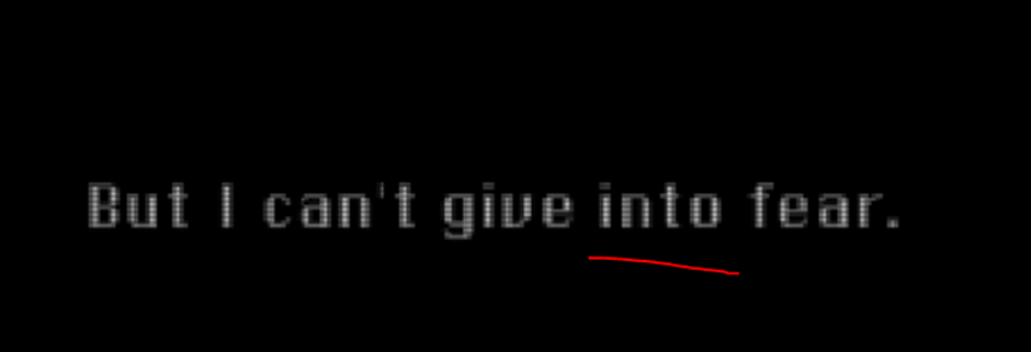
“I can't give into fear” should be “I can't give in to fear.”
On the final screen, “Thank you for Playing” should use a lowercase playing.
These are obviously extremely minor, but worth cleaning up because the rest of the presentation is so polished.
The executable itself is also still named HORRORGAMEDEMO rather than PulseBreaker.
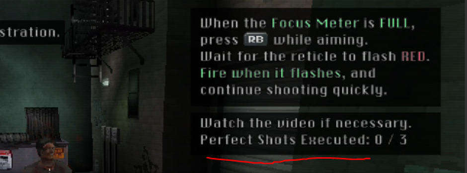
In Fig-13 above, The UI states PERFECT SHOTS EXECUTED. I interpreted this as the number of perfect shots I had performed, but I was performing considerably more than the displayed number before killing each zombie. This is counting enemies executed via perfect shots, I think the wording could communicate that more clearly.
MISC
There were also some objects on the floor that initially looked like ammunition to me. These items around this zombie looked like ammo to me. This stopped being an issue once I had learned what the actual ammunition pickups looked like, but because these were positioned around a soldier, my initial assumption was that I could collect them.

In the bathroom with no lights, a third zombie enters the room off screen. It wasn't until my second playthrough that I heard the door sound effect. The first time around I thought it had just spawned incorrectly. I think this may have been a moment designed to increase tension but I thought it was a bug, which it wasn't.
Bugs
Zombie arm clipping through wall 00:11:36:47
During the early Freya sequence, a zombie's arm visibly passes through the wall.
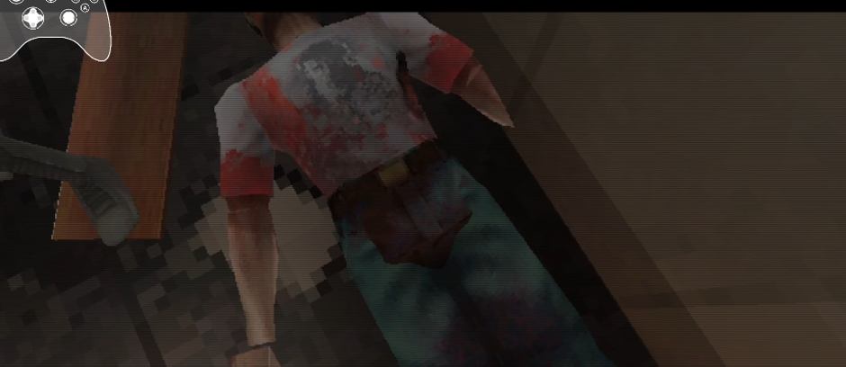
Zombie models clipping through each other 00:13:21:45
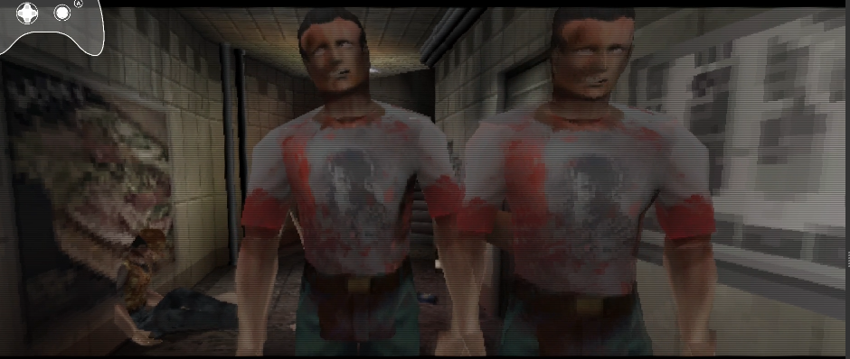
Two zombies visibly intersect during the early sequence with Freya.
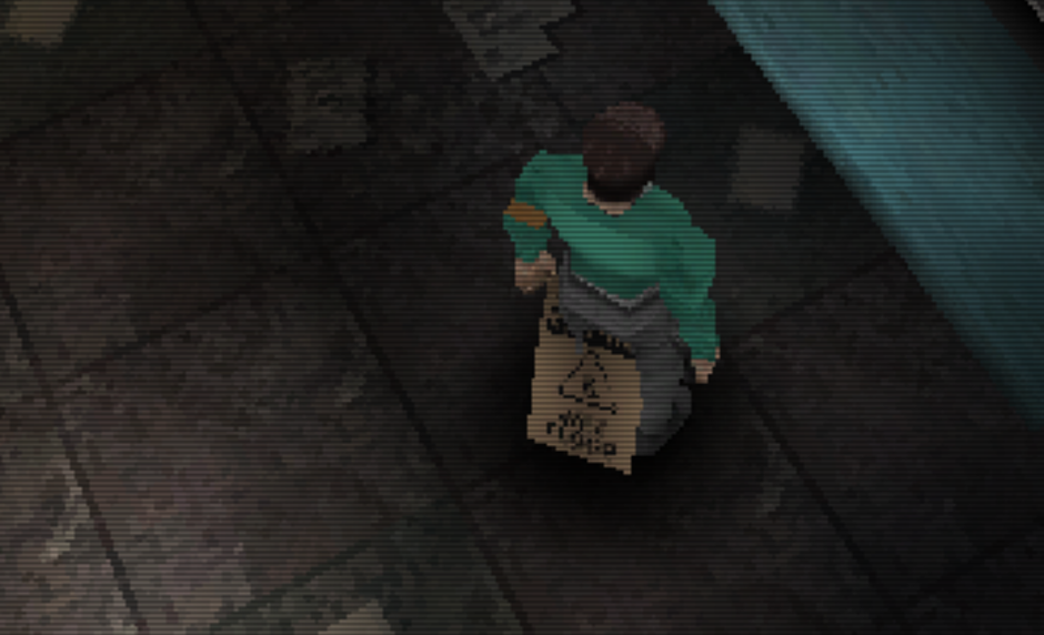
Wet floor sign has no player collision
Soren can walk directly through the wet floor sign.
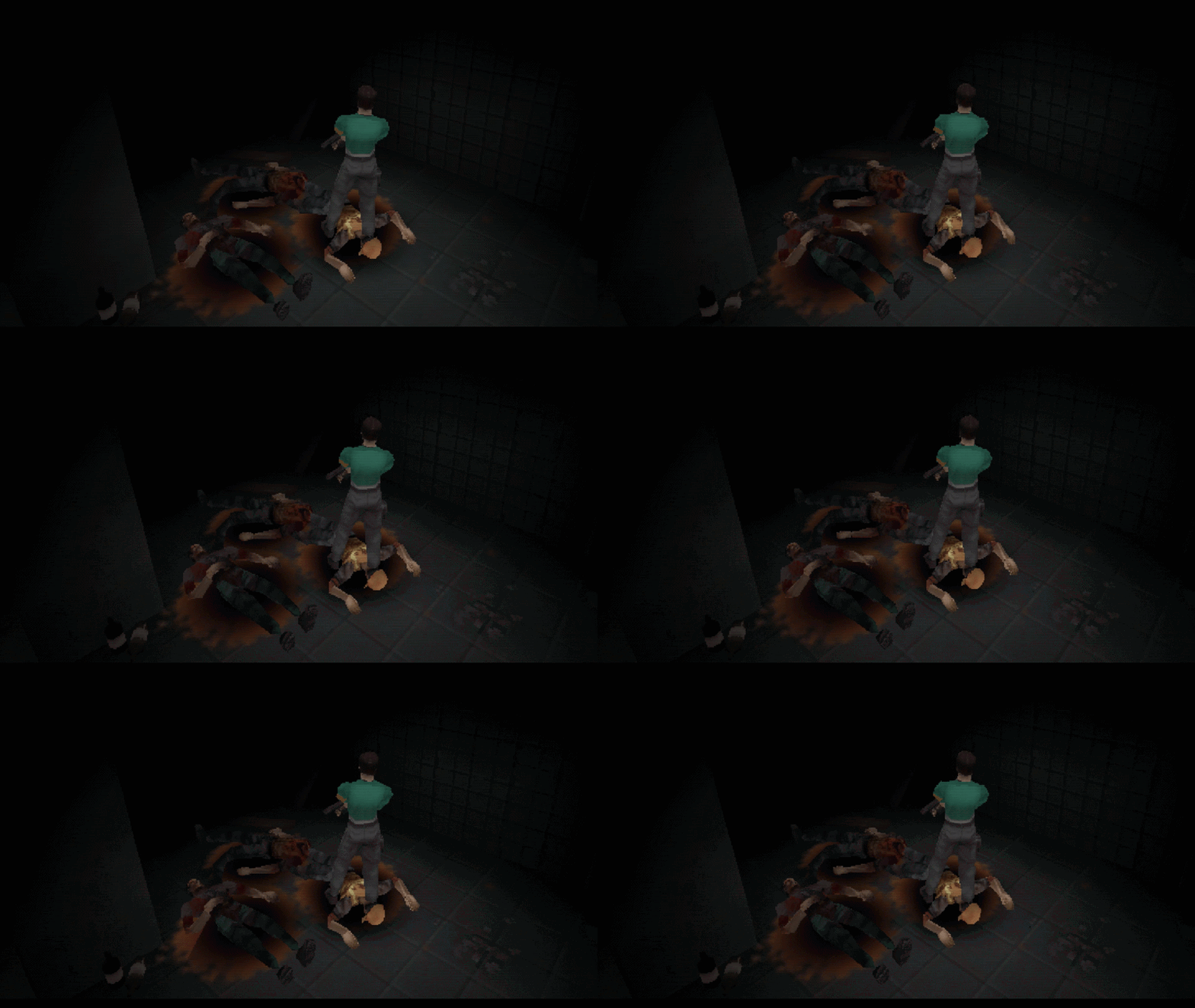
Blood Z-fighting 00:56:01:16
Visible Z-fighting occurs on blood and becomes particularly noticeable when the camera moves.
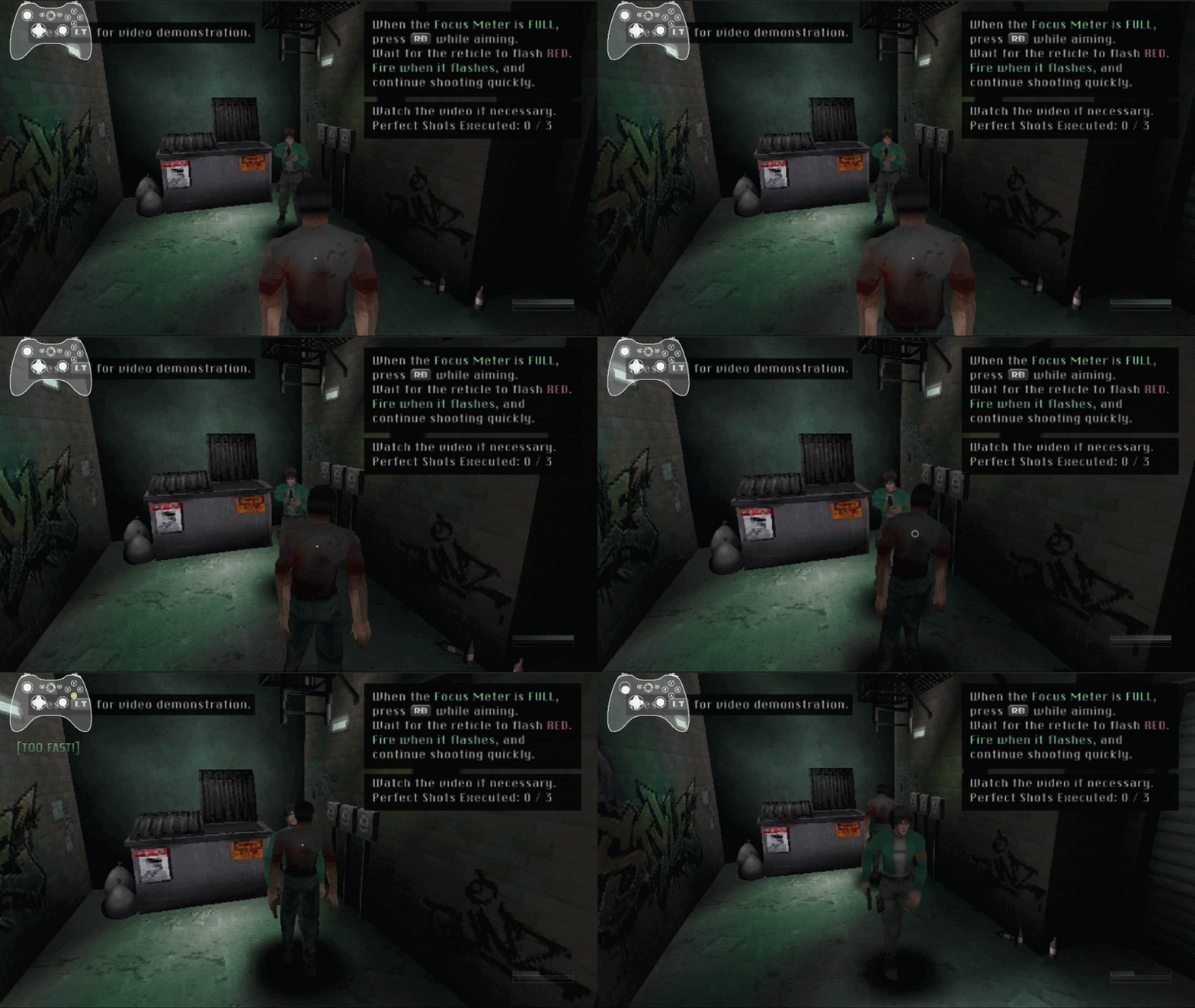
Possible enemy collision issue 00:04:41:12, 00:05:51:59
With the right timing, I was able to pass directly through zombies. This happened multiple times. I don't know whether this is intentional to prevent the player becoming trapped or whether enemy/player collision is failing.
(Gif 3 - Clipping through enemies)
Incorrect text appears when you select Load Game
“I can't give into fear” should read “I can't give in to fear.”
Incorrect capitalisation 00:55:48:12
“Thank you for Playing” should read “Thank you for playing.”
Object transparency not working 00:18:07:44
On the subway platform, you can walk behind many of the columns and they don't go transparent like the same columns outside the ticket booth do.
Game shows wrong controller settings 00:00:50:02
The game showed me PlayStation controls despite using an Xbox controller. It would be useful if the displayed prompts reflected the controller that is actually connected.
Final Thoughts
PulseBreaker left a very positive impression on me. Pulsebreaker holds its own as a survival horror, and the impression it left on me is driven by its own merits, not by simply drawing from nostalgia.
The combat is satisfying, the fixed camera composition is largely excellent, the audio design is close to impeccable and the presentation feels overall very cohesive. There are many areas where modern conveniences have been introduced without abandoning the old school survival horror identity. This game is well crafted, and something I would personally recommend to survival horror fans.
The main constructive feedback I would give is to look at how much pressure the game actually puts on the player, and consider if it needs slight tweaking. Medium felt slightly too easy to me. I took a large amount of damage without dying, infection never felt like a worry, and unlimited saving removes another potential source of pressure. None of those things are individually a problem, but together they contributed to me rarely feeling vulnerable.
I also think there is an opportunity to get more from some of the game's best horror ideas by allowing them to happen during gameplay. The zombies breaking through doors and corpses unexpectedly becoming threats are exactly the kinds of things that could make me distrust the environment afterwards. Showing them through well-made cutscenes creates great cutscenes, but for me it reduced their ability to create lasting tension.
Overall, I enjoyed every minute of the demo, completed it in one sitting and would have continued playing immediately if more had been available.